Pseudobulk Enrichment Analysis#
When cell identity clusters are well-defined, it can be advantageous to perform analyses at the pseudobulk level rather than at the single-cell level. Pseudobulking involves aggregating counts across cells of the same type within each sample, effectively creating sample-level gene expression profiles per cell type. This approach helps mitigate the effects of technical noise and dropouts common in single-cell data, enabling the detection of lowly expressed genes that might otherwise be missed.
Moreover, conducting differential expression analysis (DEA) at the pseudobulk level, treating each biological sample as the unit of observation, is statistically more robust. Unlike single-cell DEA, which assumes cells are independent (an assumption that is violated when cells originate from the same individual), sample-level pseudobulk analysis avoids inflation of p-values by reducing the number of observations and by correctly modeling biological replication [SGK+21].
The resulting gene-level statistics from pseudobulk DEA can then be used as input for downstream enrichment analyses.
In this notebook, we demonstrate how to use decoupler to infer transcription factor
(TF) and pathway enrichment scores from a multi-sample scRNA-seq human dataset.
The dataset includes 5k peripheral blood mononuclear cells (PBMCs) from healthy and COVID-19 infected patients [SCD+20]. It publicly available at the Single Cell Expression Atlas (E-MTAB-9221).
Loading Packages#
import numpy as np
import scanpy as sc
import decoupler as dc

sc.set_figure_params(figsize=(3, 3), frameon=False)
Loading The Dataset#
adata = dc.ds.covid5k()
adata
AnnData object with n_obs × n_vars = 4903 × 14120
    obs: 'individual', 'sex', 'disease', 'celltype'
    obsm: 'X_umap'
    layers: None
The obtained anndata.AnnData consist of raw integer transcript counts for ~5k cells
with measurements for ~15k genes.
The cell metadata stored in anndata.AnnData.obs can be inspected.
adata.obs
| individual | sex | disease | celltype | |
|---|---|---|---|---|
| SAMEA6979322-AGGGTTTAGGGCGAAG | SARS-CoV2 pos Severe #3 | not available | COVID-19 | B cell |
| SAMEA6979322-CCGTTCAGTTGCTCGG | SARS-CoV2 pos Severe #3 | not available | COVID-19 | B cell |
| SAMEA6979322-AACGGGAGTCCTGAAT | SARS-CoV2 pos Severe #3 | not available | COVID-19 | T cell |
| SAMEA6979322-AGGAATATCACGGTCG | SARS-CoV2 pos Severe #3 | not available | COVID-19 | T cell |
| SAMEA6979322-AGACAAACAACAGCTT | SARS-CoV2 pos Severe #3 | not available | COVID-19 | T cell |
| ... | ... | ... | ... | ... |
| SAMEA6979315-CACCGTTGTTACTCAG | Control #3 | female | normal | T cell |
| SAMEA6979315-CATCCACGTCTGTCAA | Control #3 | female | normal | T cell |
| SAMEA6979315-CATGCAAAGAAATTGC | Control #3 | female | normal | T cell |
| SAMEA6979315-ACCTGTCTCGAAGCCC | Control #3 | female | normal | T cell |
| SAMEA6979315-GTCGTAAGTACAACGG | Control #3 | female | normal | T cell |
4903 rows × 4 columns
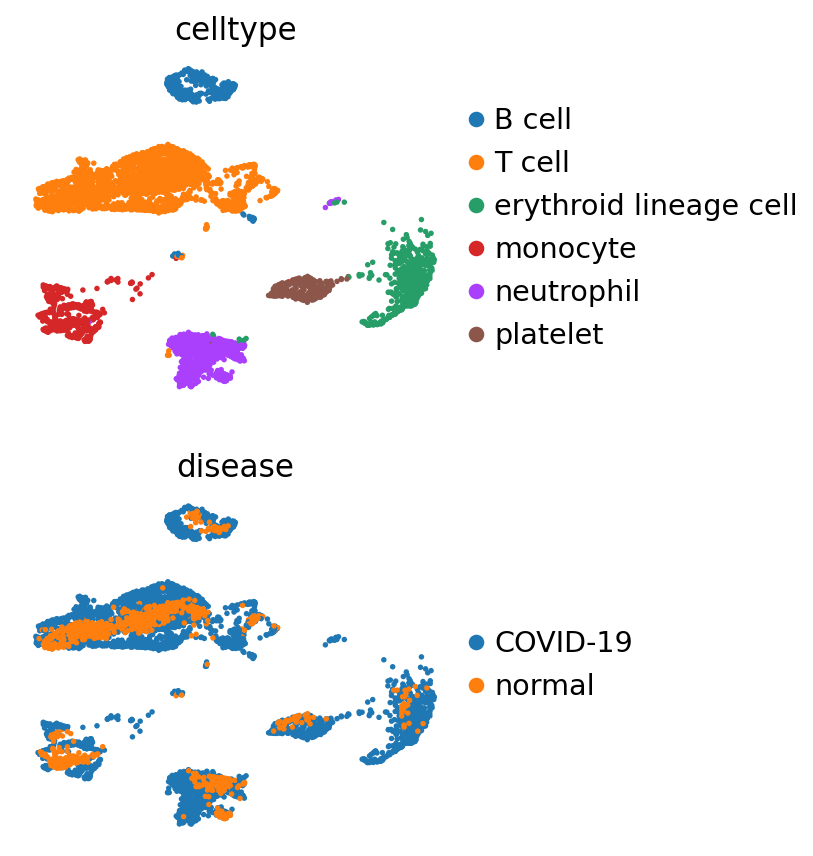
And visualized.
sc.pl.umap(adata, color=["celltype", "disease"], ncols=1)
Pseudobulking#
The pseudo-bulk approach involves the following steps:
Subsetting the cell type of interest
Extracting their raw integer counts
Summing their counts per gene into a single profile if they pass quality control
Then, DEA can be performed if there are at least two biological replicates per condition (more replicates are recommended).
Pseudobulking can easily be performed using the function decoupler.pp.pseudobulk().
In this example, the counts are just summed, though other modes such as the mean or
any custom aggregation function are available.
For more information, refer to the mode argument.
pdata = dc.pp.pseudobulk(
    adata=adata,
    sample_col="individual",
    groups_col="celltype",
    mode="sum",
)
A profile has been generated for each sample and cell type. Quality control metrics can be then visualized.
dc.pl.filter_samples(
    adata=pdata,
    groupby=["disease", "individual", "celltype"],
    min_cells=10,
    min_counts=1000,
    figsize=(5, 8),
)
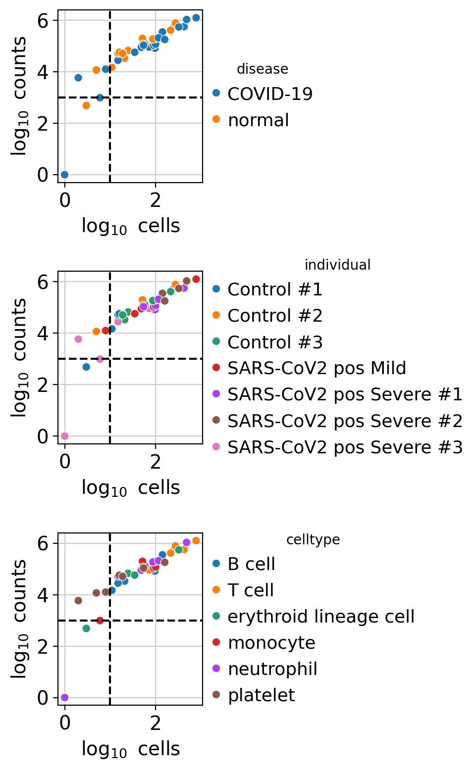
Low-quality samples can be filtered based on two criteria: the number
of cells (adata.obs.psbulk_cells) and the total count sum (adata.obs.psbulk_counts).
In this dataset, the plots show that some generated profiles contain fewer than 10 cells and 1000 counts.
These can be excluded using the function decoupler.pp.filter_samples().
Thresholds are always dataset-dependent and arbitrary, but a common guideline is to retain samples with at least 10 cells and 1000 total counts.
dc.pp.filter_samples(pdata, min_cells=10, min_counts=1000)
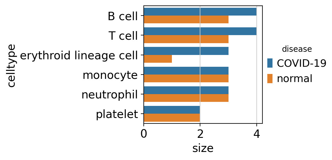
After removing low-quality samples, the remaining profiles count can be visualized.
dc.pl.obsbar(adata=pdata, y="celltype", hue="disease", figsize=(6, 3))
Variability Exploration#
With pseudobulk profiles generated for each cell type and sample, variability across them can now be explored.
This involves some basic preprocessing followed by principal component analysis (PCA).
# Store raw counts in layers
pdata.layers["counts"] = pdata.X.copy()

# Normalize, scale and compute pca
sc.pp.normalize_total(pdata, target_sum=1e4)
sc.pp.log1p(pdata)
sc.pp.scale(pdata, max_value=10)
sc.tl.pca(pdata)

# Return raw counts to X
dc.pp.swap_layer(adata=pdata, key="counts", inplace=True)
After computing the PCs, associations or correlations between each inferred PC and the variables in the metadata can be tested, depending on whether the variables are categorical or continuous.
This type of analysis is applicable to any dimensionality reduction method, such as factors derived from non-negative matrix factorization.
dc.tl.rankby_obsm(pdata, key="X_pca")
The importance of each principal component (based on its explained variance ratio) and its associations with metadata variables can then be visualized.
sc.pl.pca_variance_ratio(pdata)
dc.pl.obsm(adata=pdata, return_fig=True, nvar=5, titles=["PC scores", "Adjusted p-values"], figsize=(10, 5))
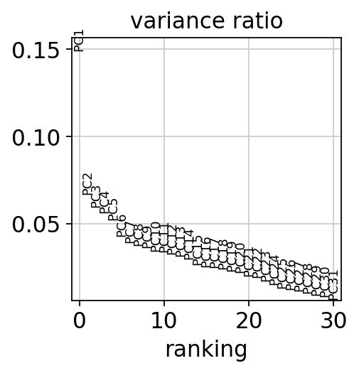
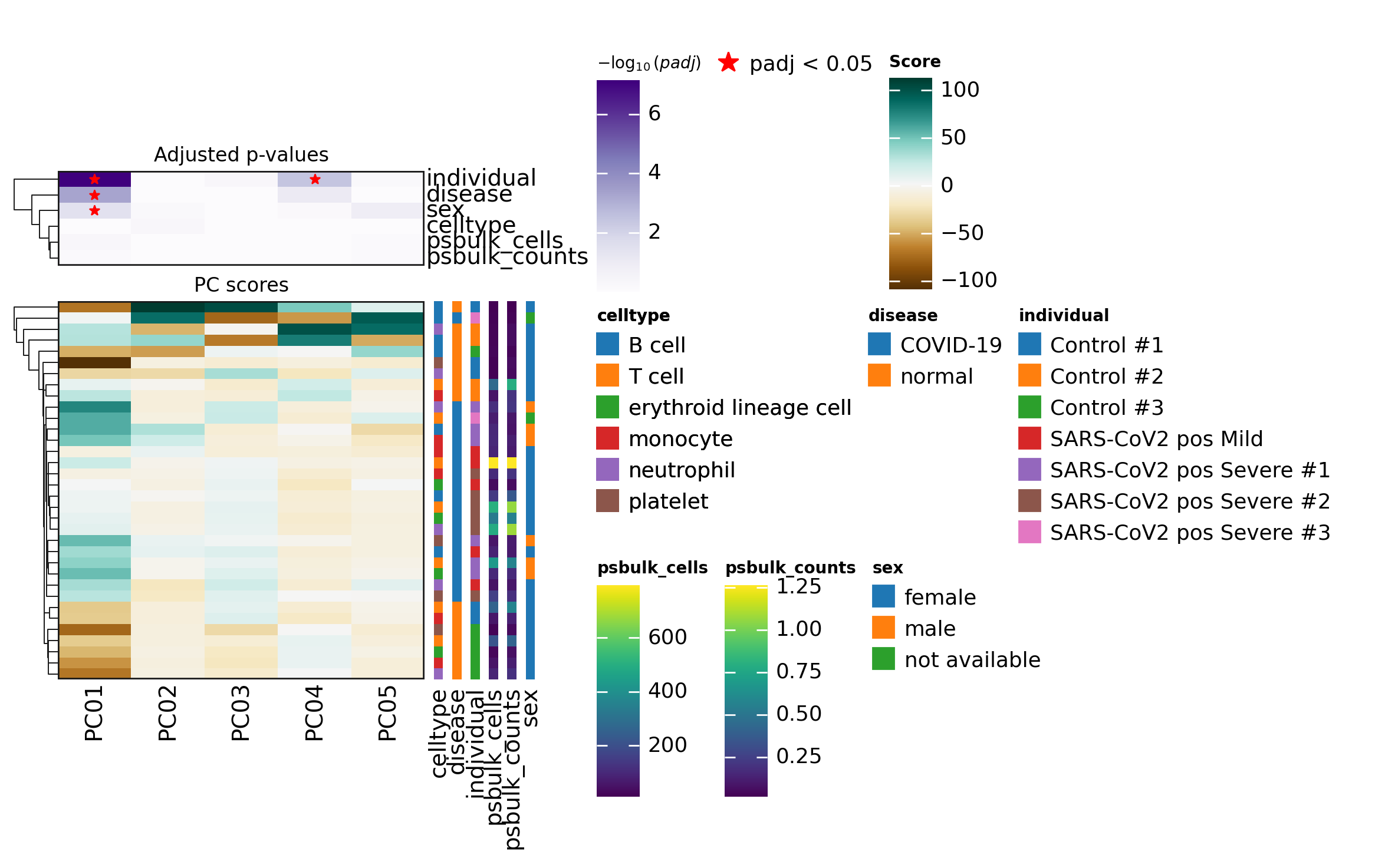
In this dataset, PC1 appears to explain the largest proportion of variance and is associated with the metadata variables individual, disease, and cell type.
Metadata variables associated with PCs that capture a substantial amount of variance are important and should be accounted for as relevant covariates in downstream differential expression analysis when possible.
The principal components can also be directly visualized, colored by these metadata variables.
sc.pl.pca(
    pdata,
    color=["individual", "disease", "sex"],
    ncols=1,
    size=300,
    frameon=True,
)
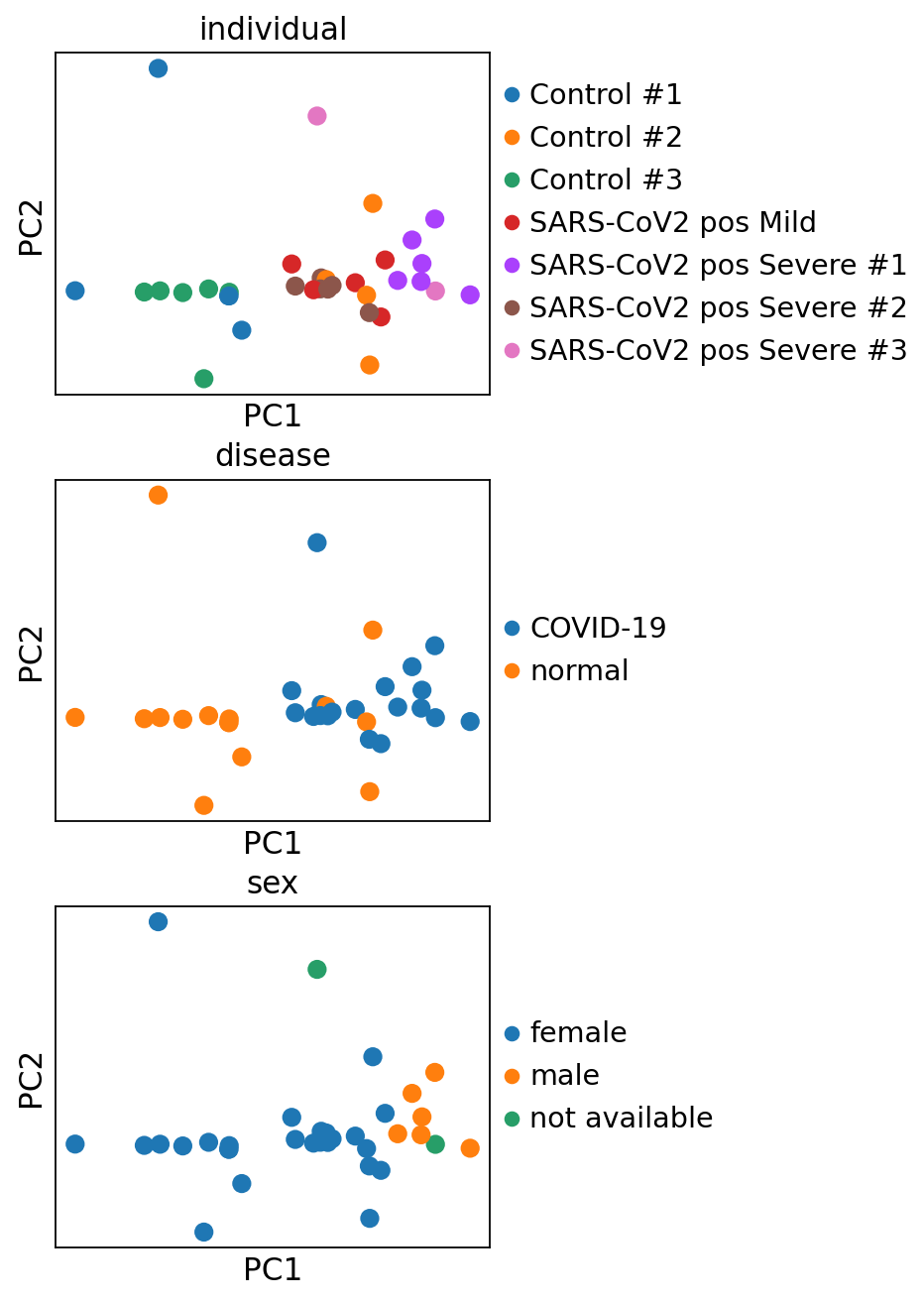
A clear separation can be observed between control and infected patients.
Feature selection#
In addition to filtering low-quality samples, lowly or noisily expressed genes can also be filtered prior to downstream analyses such as differential expression analysis. This step should be performed at the cell type level, as different cell types may express distinct sets of genes.
In this vignette, we will focus on investigating the effects of COVID-19 on T cells but this should be done for every cell type of interest.
The first step is to select the relevant samples.
tcells = pdata[pdata.obs["celltype"] == "T cell"].copy()
tcells
AnnData object with n_obs × n_vars = 7 × 14120
    obs: 'individual', 'celltype', 'sex', 'disease', 'psbulk_cells', 'psbulk_counts'
    var: 'mean', 'std'
    uns: 'log1p', 'pca', 'rank_obsm', 'individual_colors', 'disease_colors', 'sex_colors'
    obsm: 'X_pca'
    varm: 'PCs'
    layers: 'psbulk_props', None, 'counts', 'X'
Two strategies are used to filter genes:
decoupler.pp.filter_by_expr: Retains genes with a minimum total number of reads across all samples (min_total_count) and a minimum number of counts in a given number of samples (min_count). This approach was introduced in edgeR[RMS09].decoupler.pp.filter_by_prop: Retains genes that are expressed in at least a specified proportion of cells (min_prop) across a minimum number of samples (min_smpls).
The number of retained genes can be visualized, and the filtering parameters can be adjusted interactively.
dc.pl.filter_by_expr(
    adata=tcells,
    group="disease",
    min_count=10,
    min_total_count=15,
    large_n=10,
    min_prop=0.7,
)
dc.pl.filter_by_prop(
    adata=tcells,
    min_prop=0.1,
    min_smpls=2,
)
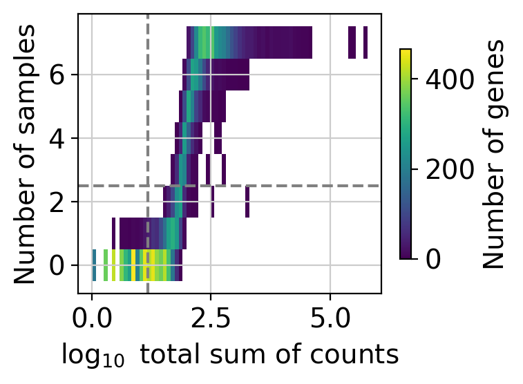
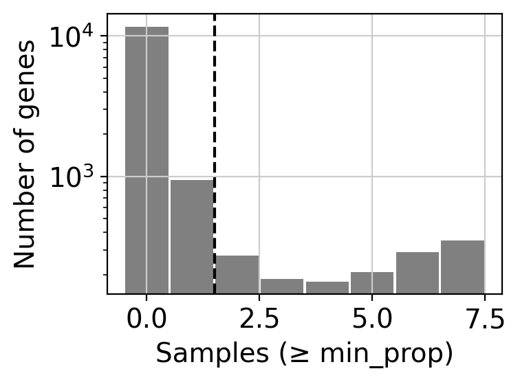
The top plot displays gene frequencies based on the filter_by_expr metrics,
while the bottom plot corresponds to filter_by_prop.
Dashed lines indicate the current threshold values. In the top plot, only genes in the upper-right quadrant are retained, in the bottom plot, only those to the right of the vertical line are kept.
Although filtering thresholds are arbitrary, a common heuristic is to look for bimodal distributions and set thresholds that separate low-quality genes from the rest.
In this example, the default parameters retain a substantial number of genes while removing potentially noisy ones.
Once the threshold parameters are set, the actual gene filtering can be performed by simply changing pl to pp.
dc.pp.filter_by_expr(
    adata=tcells,
    group="disease",
    min_count=10,
    min_total_count=15,
    large_n=10,
    min_prop=0.7,
)
dc.pp.filter_by_prop(
    adata=tcells,
    min_prop=0.1,
    min_smpls=2,
)
tcells
AnnData object with n_obs × n_vars = 7 × 1481
    obs: 'individual', 'celltype', 'sex', 'disease', 'psbulk_cells', 'psbulk_counts'
    var: 'mean', 'std'
    uns: 'log1p', 'pca', 'rank_obsm', 'individual_colors', 'disease_colors', 'sex_colors'
    obsm: 'X_pca'
    varm: 'PCs'
    layers: 'psbulk_props', None, 'counts', 'X'
Differential Expression Analysis#
Differential expression analysis (DEA) can be used to identify genes that differ most between disease and control conditions. Given the observed association of gene expression with both sex and disease status, the experimental design will include these covariates to account for their effects.
We will use the Python implementation of the DESeq2 framework [MTCA23], though other tools like limma
[RPW+15] or edgeR [RMS09] could also be used.
For a deeper understanding of how pyDESeq2 works, refer to its
official documentation.
Note that even more complex experimental designs can be accommodated by adding additional factors to the design formula.
# Import DESeq2
from pydeseq2.dds import DeseqDataSet, DefaultInference
from pydeseq2.ds import DeseqStats

# Build DESeq2 object
inference = DefaultInference(n_cpus=8)
dds = DeseqDataSet(
    adata=tcells,
    design="~disease + sex",
    refit_cooks=True,
    inference=inference,
)

# Compute LFCs
dds.deseq2()

# Extract contrast between conditions
stat_res = DeseqStats(dds, contrast=["disease", "COVID-19", "normal"], inference=inference)

# Compute Wald test
stat_res.summary()
Using None as control genes, passed at DeseqDataSet initialization
Log2 fold change & Wald test p-value: disease COVID-19 vs normal
             baseMean  log2FoldChange     lfcSE      stat    pvalue      padj
KRIT1       32.613428        0.467672  0.587002  0.796713  0.425618  0.993014
CD99       101.782417       -0.384642  0.473409 -0.812494  0.416508  0.993014
CFLAR      120.400699       -0.115262  0.468750 -0.245891  0.805766  0.993014
SLC25A5     96.479260       -0.316859  0.452774 -0.699818  0.484041  0.993014
KMT2E       99.095762        0.253314  0.431626  0.586882  0.557283  0.993014
...               ...             ...       ...       ...       ...       ...
NOTCH2NLC   63.444550       -0.111294  0.524252 -0.212292  0.831879  0.993770
EIF5A      105.639111       -0.536538  0.462442 -1.160227  0.245956  0.993014
ACAP1       72.210348       -0.141184  0.534609 -0.264088  0.791712  0.993014
LDHA        97.989313       -0.577908  0.491649 -1.175447  0.239816  0.993014
RPSA2      105.441371       -1.899882  0.661305 -2.872927  0.004067  0.993014

[1481 rows x 6 columns]
# Extract results
results_df = stat_res.results_df
results_df
| baseMean | log2FoldChange | lfcSE | stat | pvalue | padj | |
|---|---|---|---|---|---|---|
| KRIT1 | 32.613428 | 0.467672 | 0.587002 | 0.796713 | 0.425618 | 0.993014 |
| CD99 | 101.782417 | -0.384642 | 0.473409 | -0.812494 | 0.416508 | 0.993014 |
| CFLAR | 120.400699 | -0.115262 | 0.468750 | -0.245891 | 0.805766 | 0.993014 |
| SLC25A5 | 96.479260 | -0.316859 | 0.452774 | -0.699818 | 0.484041 | 0.993014 |
| KMT2E | 99.095762 | 0.253314 | 0.431626 | 0.586882 | 0.557283 | 0.993014 |
| ... | ... | ... | ... | ... | ... | ... |
| NOTCH2NLC | 63.444550 | -0.111294 | 0.524252 | -0.212292 | 0.831879 | 0.993770 |
| EIF5A | 105.639111 | -0.536538 | 0.462442 | -1.160227 | 0.245956 | 0.993014 |
| ACAP1 | 72.210348 | -0.141184 | 0.534609 | -0.264088 | 0.791712 | 0.993014 |
| LDHA | 97.989313 | -0.577908 | 0.491649 | -1.175447 | 0.239816 | 0.993014 |
| RPSA2 | 105.441371 | -1.899882 | 0.661305 | -2.872927 | 0.004067 | 0.993014 |
1481 rows × 6 columns
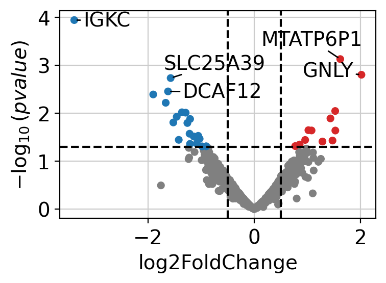
The results can be visualized using a volcano plot.
dc.pl.volcano(results_df, x="log2FoldChange", y="pvalue")
After performing DEA, we can use the resulting gene-level statistics for enrichment analysis.
While any statistic can be used, we recommend using t-values rather than log2FCs, as t-values account for the
significance of the change.
We will transform the obtained t-values, stored in the column stat, into a wide matrix format so that it can be
used with decoupler.
data = results_df[["stat"]].T.rename(index={"stat": "disease.vs.normal"})
data
| KRIT1 | CD99 | CFLAR | SLC25A5 | KMT2E | MYCBP2 | ITGAL | REX1BD | PAFAH1B1 | PSMB1 | ... | PSME2 | PSME1 | FNBP4 | NEDD8 | ATP5IF1 | NOTCH2NLC | EIF5A | ACAP1 | LDHA | RPSA2 | |
|---|---|---|---|---|---|---|---|---|---|---|---|---|---|---|---|---|---|---|---|---|---|
| disease.vs.normal | 0.796713 | -0.812494 | -0.245891 | -0.699818 | 0.586882 | 0.288841 | 0.725996 | 0.286914 | -0.137428 | -0.892353 | ... | -1.170799 | -0.547758 | 0.722307 | -0.803488 | -1.050973 | -0.212292 | -1.160227 | -0.264088 | -1.175447 | -2.872927 |
1 rows × 1481 columns
Enrichment analysis#
Enrichment analysis tests whether a specific set of omics features is “overrepresented” or “coordinated” in the measured data compared to a background distribution. These sets are predefined based on existing biological knowledge and may vary depending on the omics technology used.
Enrichment analysis requires the use of an enrichment method, and several options are available.
In the original manuscript of decoupler [BiMVSB+22], we benchmarked multiple methods
and found that the univariate linear model (ulm) outperformed the others. Therefore, we will use
ulm in this vignette.
The scores from decoupler.mt.ulm() should be interpreted such that larger magnitudes indicate
greater significance, while the sign reflects whether the features in the set are overrepresented
(positive) or underrepresented (negative) compared to the background.
Transcription factor scoring from gene regulatory networks#
Transcription factors (TFs) are genes that, once translated into proteins, bind to DNA and regulate the expression of other genes by either promoting or inhibiting their transcription. Gene Regulatory Networks (GRNs) capture these TF-gene interactions and can be constructed from prior knowledge or inferred from omics data. The fundamental unit of a GRN is a TF and its associated target genes, collectively known as a regulon. Each regulon functions as a gene set in enrichment analysis.
Although TFs are measured in transcriptomic data, their transcript levels often do not reflect their actual activity in a given cell. Instead, scoring TFs through enrichment analysis based on the expression of their target genes provides a more accurate representation of their regulatory activity [BiMWMullerD+23].
CollecTRI network#
CollecTRI is a comprehensive resource containing a curated collection of TFs and their transcriptional targets compiled from 12 different resources [MullerDTV+23]. This collection provides an increased coverage of transcription factors and a superior performance in identifying perturbed TFs compared to other literature based GRNs such as DoRothEA [GAHI+19]. Similar to DoRothEA, interactions are weighted by their mode of regulation (activation or inhibition).
In this tutorial we will use the human version but other organisms are available.
We can use decoupler to retrieve it from the OmniPath server [TureiKSR16].
Note In this tutorial we use the network CollecTRI, but we could use any other GRN coming from an inference method such as CellOracle, pySCENIC or SCENIC+.
collectri = dc.op.collectri(organism="human")
collectri
| source | target | weight | resources | references | sign_decision | |
|---|---|---|---|---|---|---|
| 0 | MYC | TERT | 1.0 | DoRothEA-A;ExTRI;HTRI;NTNU.Curated;Pavlidis202... | 10022128;10491298;10606235;10637317;10723141;1... | PMID |
| 1 | SPI1 | BGLAP | 1.0 | ExTRI | 10022617 | default activation |
| 2 | SMAD3 | JUN | 1.0 | ExTRI;NTNU.Curated;TFactS;TRRUST | 10022869;12374795 | PMID |
| 3 | SMAD4 | JUN | 1.0 | ExTRI;NTNU.Curated;TFactS;TRRUST | 10022869;12374795 | PMID |
| 4 | STAT5A | IL2 | 1.0 | ExTRI | 10022878;11435608;17182565;17911616;22854263;2... | default activation |
| ... | ... | ... | ... | ... | ... | ... |
| 42985 | NFKB | hsa-miR-143-3p | 1.0 | ExTRI | 19472311 | default activation |
| 42986 | AP1 | hsa-miR-206 | 1.0 | ExTRI;GEREDB;NTNU.Curated | 19721712 | PMID |
| 42987 | NFKB | hsa-miR-21 | 1.0 | ExTRI | 20813833;22387281 | default activation |
| 42988 | NFKB | hsa-miR-224-5p | 1.0 | ExTRI | 23474441;23988648 | default activation |
| 42989 | AP1 | hsa-miR-144-3p | 1.0 | ExTRI | 23546882 | default activation |
42990 rows × 6 columns
Scoring#
TF scores can be easily computed by running the ulm method.
# Run
tf_acts, tf_padj = dc.mt.ulm(data=data, net=collectri)

# Filter by sign padj
msk = (tf_padj.T < 0.05).iloc[:, 0]
tf_acts = tf_acts.loc[:, msk]

tf_acts
| ATF2 | ATF3 | ATF4 | GATA1 | KLF8 | MYC | NFE2 | |
|---|---|---|---|---|---|---|---|
| disease.vs.normal | 3.701497 | 4.200955 | 3.196892 | -3.942943 | 3.80432 | -3.480026 | -3.45264 |
The obtained scores for the most active and inactive TFs can be visualized as follows.
dc.pl.barplot(data=tf_acts, name="disease.vs.normal", figsize=(4, 3))
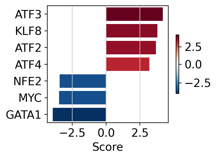
ATF3, KLF8 and ATF2 appear to be the most activated TFs in this treatment, while GATA1, MYC and NFE2 appear to be inactivated.
A network of selected TFs (top and bottom ranked by activity) can also be visualized, with nodes colored by TF activity and target gene-level statistics.
dc.pl.network(
    net=collectri,
    data=data,
    score=tf_acts,
    sources=["ATF3", "KLF8", "GATA1", "MYC"],
    targets=5,
    figsize=(5, 5),
    vcenter=True,
    by_abs=True,
    size_node=15,
    t_label="Gene-level\nstatistic",
)
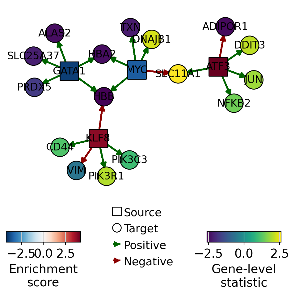
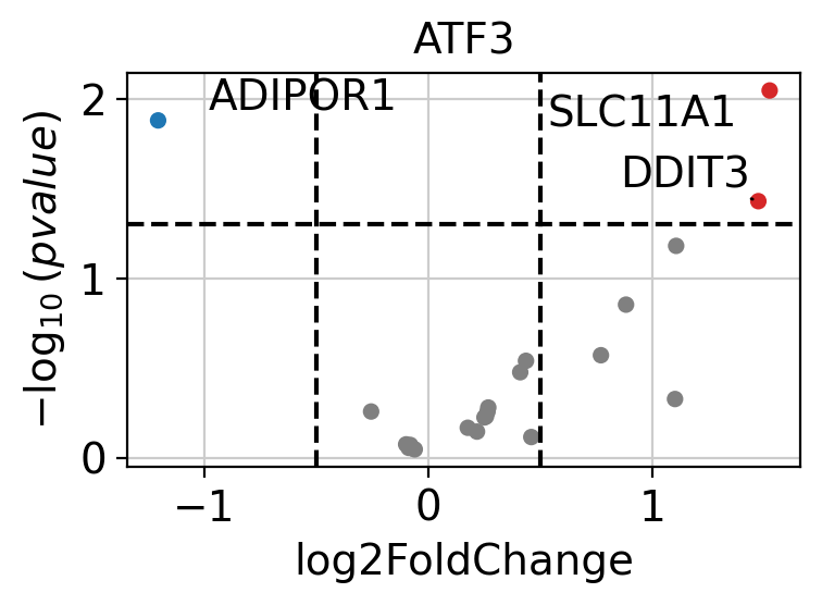
ATF3 appears to be active in disease cells, as its positively regulated targets are upregulated.
If needed, we can also look at a volcano plot of the target genes.
dc.pl.volcano(
    data=results_df,
    x="log2FoldChange",
    y="pvalue",
    net=collectri,
    name="ATF3",
    top=10,
)
Pathway Scoring#
The same approach used for TF scoring can also be applied to pathways. Numerous
databases provide curated pathway gene sets, with one of the most well-known being MSigDB, which
includes several collections [LSP+11].
These and many other resources can be accessed using the function decoupler.op.resource().
To view the list of available databases, use decoupler.op.show_resources().
PROGENy Pathway Genes#
PROGENy is a comprehensive resource that provides a curated collection of pathways and their target genes, along with weights for each interaction [SKK+18].
Below is a brief description of each pathway:
Androgen: involved in the growth and development of the male reproductive organs
EGFR: regulates growth, survival, migration, apoptosis, proliferation, and differentiation in mammalian cells
Estrogen: promotes the growth and development of the female reproductive organs
Hypoxia: promotes angiogenesis and metabolic reprogramming when O2 levels are low
JAK-STAT: involved in immunity, cell division, cell death, and tumor formation
MAPK: integrates external signals and promotes cell growth and proliferation
NFkB: regulates immune response, cytokine production and cell survival
p53: regulates cell cycle, apoptosis, DNA repair and tumor suppression
PI3K: promotes growth and proliferation
TGFb: involved in development, homeostasis, and repair of most tissues
TNFa: mediates haematopoiesis, immune surveillance, tumour regression and protection from infection
Trail: induces apoptosis
VEGF: mediates angiogenesis, vascular permeability, and cell migration
WNT: regulates organ morphogenesis during development and tissue repair
This is how to access to it.
progeny = dc.op.progeny(organism="human")
progeny
| source | target | weight | padj | |
|---|---|---|---|---|
| 0 | Androgen | TMPRSS2 | 11.490631 | 2.384806e-47 |
| 1 | Androgen | NKX3-1 | 10.622551 | 2.205102e-44 |
| 2 | Androgen | MBOAT2 | 10.472733 | 4.632376e-44 |
| 3 | Androgen | KLK2 | 10.176186 | 1.944410e-40 |
| 4 | Androgen | SARG | 11.386852 | 2.790210e-40 |
| ... | ... | ... | ... | ... |
| 62416 | p53 | ENPP2 | 2.771405 | 4.993215e-02 |
| 62417 | p53 | ARRDC4 | 3.494328 | 4.996747e-02 |
| 62418 | p53 | MYO1B | -1.148057 | 4.997905e-02 |
| 62419 | p53 | CTSC | -1.784693 | 4.998864e-02 |
| 62420 | p53 | NAA50 | -1.435013 | 4.998884e-02 |
62421 rows × 4 columns
Scoring#
Pathway scores can be readily computed by running the ulm method.
# Run
pw_acts, pw_padj = dc.mt.ulm(data=data, net=progeny)

# Filter by sign padj
msk = (pw_padj.T < 0.05).iloc[:, 0]
pw_acts = pw_acts.loc[:, msk]

pw_acts
| Estrogen | Hypoxia | NFkB | PI3K | TGFb | TNFa | |
|---|---|---|---|---|---|---|
| disease.vs.normal | -3.009097 | 3.780007 | 4.048853 | -2.391889 | 3.208565 | 2.860707 |
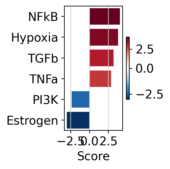
The obtained scores for the most active and inactive pathways can be visualized as follows
dc.pl.barplot(data=pw_acts, name="disease.vs.normal", figsize=(3, 3))
They can also be visualized as follows
# Transform to df
df = pw_acts.melt(value_name="score").merge(
    pw_padj.melt(value_name="pvalue")
    .assign(logpval=lambda x: x["pvalue"].clip(2.22e-4, 1))
    .assign(logpval=lambda x: -np.log10(x["logpval"]))
)
dc.pl.dotplot(df=df, x="score", y="variable", s="logpval", c="score", scale=1, figsize=(4, 4))
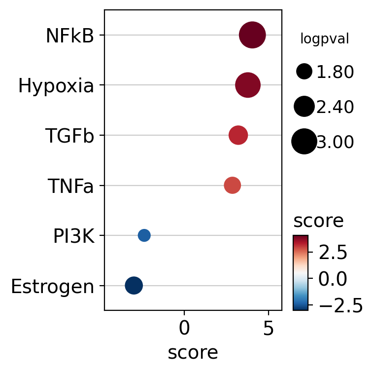
COVID patients exhibit increased activity of the NFkB, Hypoxia, TGFb, and TNFa pathways in T cells.
Conversely, the disease is associated with reduced activity in pathways such as Estrogen and PI3K.
Targets of the NFkB pathway can be visualized in a scatter plot.
dc.pl.source_targets(data=results_df, x="weight", y="stat", net=progeny, name="NFkB", top=15, figsize=(4, 4))
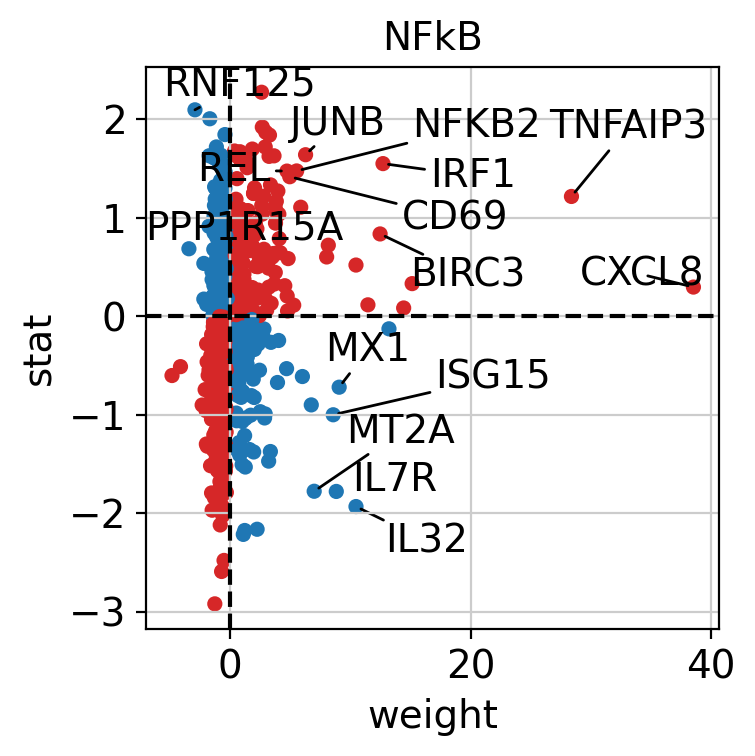
The observed activation of the Hypoxia pathway is driven by the fact that many of its positively weighted target genes have positive t-values.
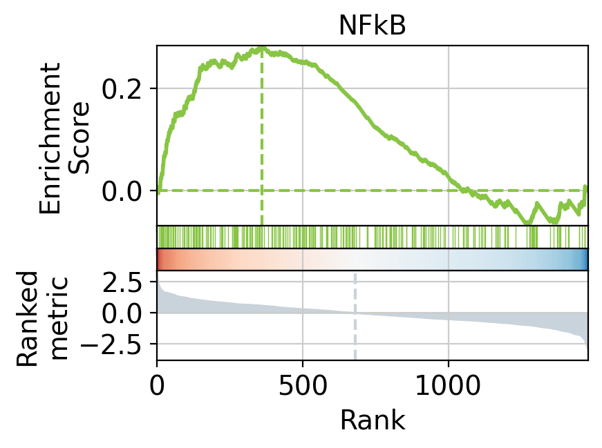
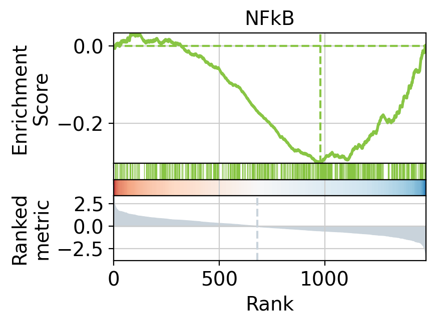
We can also visualize the targets of NFkB as a leading edge plot.
Because PROGENy includes both positive and negative target genes, the leading edge plot can be separated into positive and negative components.
_, pos_le = dc.pl.leading_edge(
    results_df,
    stat="stat",
    net=progeny[progeny["weight"] > 0],
    name="NFkB",
)
print("(+) leading edge:", pos_le[:5])
_, neg_le = dc.pl.leading_edge(
    results_df,
    stat="stat",
    net=progeny[progeny["weight"] < 0],
    name="NFkB",
)
print("(-) leading edge:", neg_le[:5])
(+) leading edge: ['NR4A2' 'PLK3' 'P2RX7' 'JUN' 'SQSTM1']
(-) leading edge: ['DCAF12' 'SNCA' 'ADIPOR1' 'ZMAT2' 'BSG']
Hallmark gene sets#
Hallmark gene sets are curated collections of genes that represent specific, well-defined biological states or processes. They are part of MSigDB and were developed to reduce redundancy and improve interpretability compared to older, more overlapping gene set collections [LSP+11].
A total of 50 gene sets are provided, designed to be non-redundant, concise, and biologically coherent.
This is how to access them.
hallmark = dc.op.hallmark(organism="human")
hallmark
| source | target | |
|---|---|---|
| 0 | IL2_STAT5_SIGNALING | MAFF |
| 1 | COAGULATION | MAFF |
| 2 | HYPOXIA | MAFF |
| 3 | TNFA_SIGNALING_VIA_NFKB | MAFF |
| 4 | COMPLEMENT | MAFF |
| ... | ... | ... |
| 7313 | PANCREAS_BETA_CELLS | STXBP1 |
| 7314 | PANCREAS_BETA_CELLS | ELP4 |
| 7315 | PANCREAS_BETA_CELLS | GCG |
| 7316 | PANCREAS_BETA_CELLS | PCSK2 |
| 7317 | PANCREAS_BETA_CELLS | PAX6 |
7318 rows × 2 columns
Scoring#
Pathway scores can be easily computed by running the ulm method.
# Run
hm_acts, hm_padj = dc.mt.ulm(data=data, net=hallmark)

# Filter by sign padj
msk = (hm_padj.T < 0.05).iloc[:, 0]
hm_acts = hm_acts.loc[:, msk]

hm_acts
| HEME_METABOLISM | INFLAMMATORY_RESPONSE | MYC_TARGETS_V1 | OXIDATIVE_PHOSPHORYLATION | REACTIVE_OXYGEN_SPECIES_PATHWAY | TNFA_SIGNALING_VIA_NFKB | |
|---|---|---|---|---|---|---|
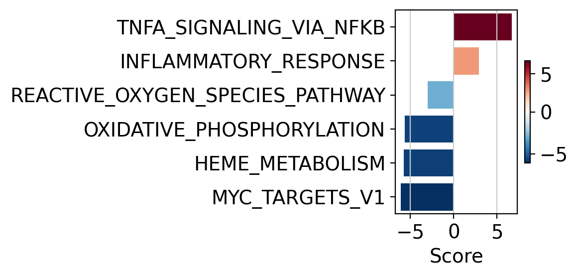
| disease.vs.normal | -5.765798 | 2.890019 | -6.108873 | -5.684728 | -2.995654 | 6.699871 |
The obtained scores for the most active and inactive pathways can be visualized as follows.
dc.pl.barplot(data=hm_acts, name="disease.vs.normal", figsize=(6, 3))
Or alternatively like this.
# Tranform to df
df = hm_acts.melt(value_name="score").merge(
    hm_padj.melt(value_name="pvalue")
    .assign(padj=lambda x: x["pvalue"].clip(2.22e-16, 1))
    .assign(padj=lambda x: np.log10(x["pvalue"]))
)
dc.pl.dotplot(df=df, x="score", y="variable", s="padj", c="score", scale=0.25, figsize=(6, 3))
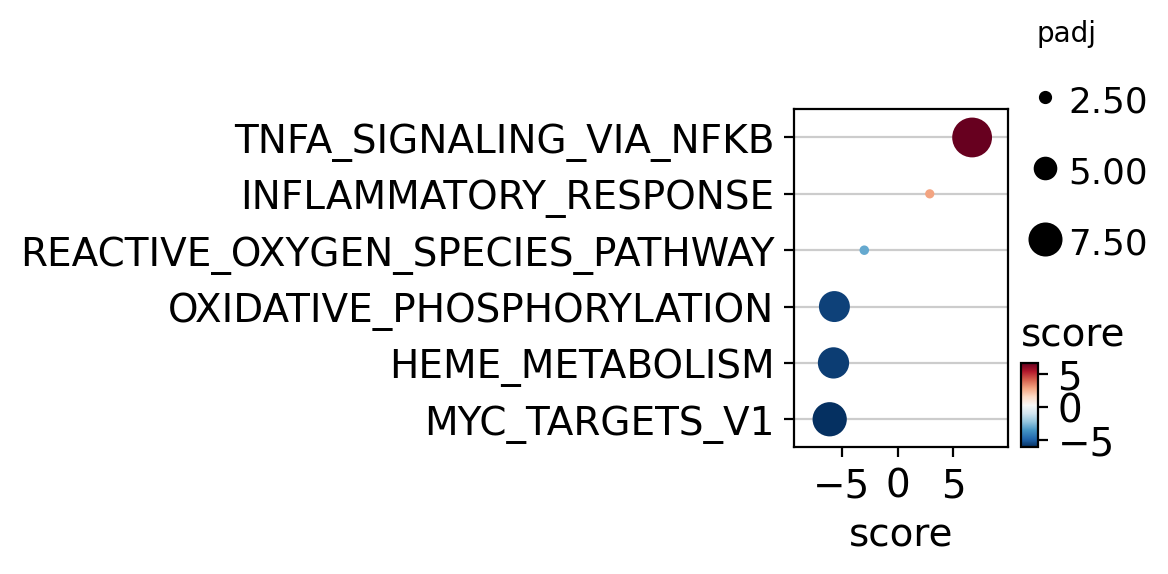
COVID patients exhibit increased activity for TNFA_SIGNALING_VIA_NFKB.
Conversely, the disease is associated with reduced activity in
MYC_TARGETS_V1, HEME_METABOLISM and OXIDATIVE_PHOSPHORYLATION.
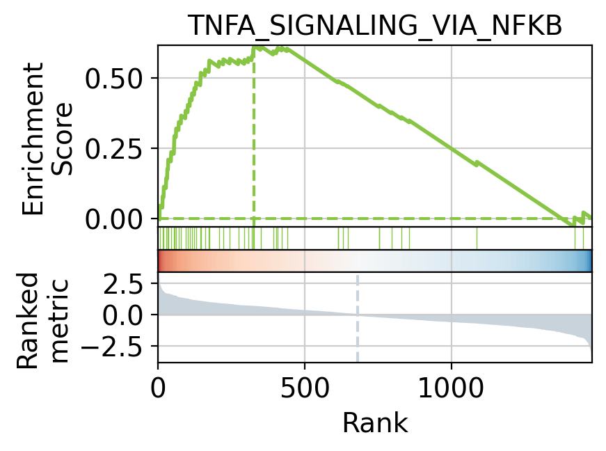
Targets of the TNFA_SIGNALING_VIA_NFKB can be visualized as a leading
edge plot.
_, le = dc.pl.leading_edge(
    results_df,
    stat="stat",
    net=hallmark,
    name="TNFA_SIGNALING_VIA_NFKB",
)
print("leading edge:", le[:5])
leading edge: ['NR4A2' 'JUN' 'SQSTM1' 'JUNB' 'IER5']